Mobile Websites and Responsive Design
Did you know that Internet usage from Mobile Phones has exceeded Internet usage from personal computers?
In February 2014, Internet usage from mobile apps alone was larger than from computers and the gap is increasing all the time…
And if your website looks ‘lousy’ on a smartphone or tablet, you’re potentially passing up a lot of business…
You need a ‘mobile friendly’ website…
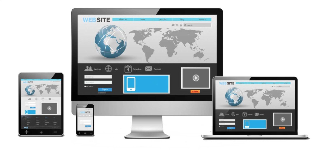
These days, the Internet is consumed on many different devices and unfortunately for webmasters, all things are not equal…
Devices have different screen sizes, resolutions and browsers and if you website has been designed with a computer in mind, it probably isn’t easy to view on a smartphone or tablet…
And when you consider that 4 of 5 consumers shop on a smartphone and 70% of mobile searches lead to an action within an hour, you can’t afford to miss out on this market…
You have two choices…
- A Responsive Website.
- A Mobile Website.
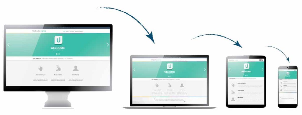
A responsive website is a single website that will adapt itself for optimised viewing on different devices and resolutions…
A mobile website on the other hand is a separate website that will live on a subdomain of your existing site, developed exclusively with mobile phones in mind…
Whatever your requirements, we can help you…
At Scuffle Networks we can handle the development of both responsive and mobile website, it all depends on your unique requirements…
If you already have a website that you’re happy with, maybe an accompanying mobile site would work best for you. On the other hand, if you feel that your website needs a refresh anyway, a full responsive site could be the best solution…
Give us a call for a no obligation chat to see which would be a best fit for your needs…
Regards,

Sonny Brown
ICT Solutions
Scuffle Networks
Call Sonny directly on 0422 901 680

Mobiles and Tablets
Mobile Website
Responsive Website
User Experience
P.P.S. Mobile websites have a variety of features including ‘one click directions’ and ‘click to call’ which increase the number of leads that you generate. If you only have a traditional website, not only will your website render differently on a phone, making it difficult to navigate, you’ll also be missing out on this lead generating functionality…